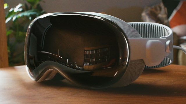

Apple Vision Pro has brought new ideas to the table about how XR apps should be designed, controlled, and built. In this Guest Article, Sterling Crispin offers up a concise guide for what first-time XR developers should keep in mind as they approach app development for Apple Vision Pro.
Guest Article by Sterling Crispin
Sterling Crispin is an artist and software engineer with a decade of experience in the spatial computing industry. His work has spanned between product design and the R&D of new technologies at companies like Apple, Snap Inc, and various other tech startups working on face computers.
Editor’s Note: The author would like to remind readers that he is not an Apple representative; this info is personal opinion and does not contain non-public information. Additionally, more info on Vision Pro development can be found in Apple’s WWDC23 videos (select Filter → visionOS).
Ahead is my advice for designing and developing products for Vision Pro. This article includes a basic overview of the platform, tools, porting apps, general product design, prototyping, perceptual design, business advice, and more.
Overview
Apps on visionOS are organized into ‘scenes’, which are Windows, Volumes, and Spaces.
Windows are a spatial version of what you’d see on a normal computer. They’re bounded rectangles of content that users surround themselves with. These may be windows from different apps or multiple windows from one app.
Volumes are things like 3D objects, or small interactive scenes. Like a 3D map, or small game that floats in front of you rather than being fully immersive.
Spaces are fully immersive experiences where only one app is visible. That could be full of many Windows and Volumes from your app. Or like VR games where the system goes away and it’s all fully immersive content that surrounds you. You can think of visionOS itself like a Shared Space where apps coexist together and you have less control. Whereas Full Spaces give you the most control and immersiveness, but don’t coexist with other apps. Spaces have immersion styles: mixed, progressive, and full. Which defines how much or little of the real world you want the user to see.
User Input
Users can look at the UI and pinch like the Apple Vision Pro demo videos show. But you can also reach out and tap on windows directly, sort of like it’s actually a floating iPad. Or use a bluetooth trackpad or video game controller. You can also look and speak in search bars. There’s also a Dwell Control for eyes-only input, but that’s really an accessibility feature. For a simple dev approach, your app can just use events like a TapGesture. In this case, you won’t need to worry about where these events originate from.
Spatial Audio
Vision Pro has an advanced spatial audio system that makes sounds seem like they’re really in the room by considering the size and materials in your room. Using subtle sounds for UI interaction and taking advantage of sound design for immersive experiences is going to be really important. Make sure to take this topic seriously.
Development
If you want to build something that works between Vision Pro, iPad, and iOS, you’ll be operating within the Apple dev ecosystem, using tools like XCode and SwiftUI. However, if your goal is to create a fully immersive VR experience for Vision Pro that also works on other headsets like Meta’s Quest or PlayStation VR, you have to use Unity.
Apple Tools
For Apple’s ecosystem, you’ll use SwiftUI to create the UI the user sees and the overall content of your app. RealityKit is the 3D rendering engine that handles materials, 3D objects, and light simulations. You’ll use ARKit for advanced scene understanding, like if you want someone to throw virtual darts and have them collide with their real wall, or do advanced things with hand tracking. But those rich AR features are only available in Full Spaces. There’s also Reality Composer Pro which is a 3D content editor that lets you drag things around a 3D scene and make media rich Spaces or Volumes. It’s like diet-Unity that’s built specifically for this development stack.
One cool thing with Reality Composer is that it’s already full of assets, materials, and animations. That helps developers who aren’t artists build something quickly and should help to create a more unified look and feel to everything built with the tool. Pros and cons to that product decision, but overall it should be helpful.
Existing iOS Apps
If you’re bringing an iPad or iOS app over, it will probably work unmodified as a Window in the Shared Space. If your app supports both iPad and iPhone, the headset will use the iPad version.
To customize your existing iOS app to take better advantage of the headset you can use the Ornament API to make little floating islands of UI in front of, or besides your app, to make it feel more spatial. Ironically, if your app is using a lot of ARKit features, you’ll likely need to ‘reimagine’ it significantly to work on Vision Pro, as ARKit has been upgraded a lot for the headset.
If you’re excited about building something new for Vision Pro, my personal opinion is that you should prioritize how your app will provide value across iPad and iOS too. Otherwise you’re losing out on hundreds of millions of users.
Unity
You can build to Vision Pro with the Unity game engine, which is a massive topic. Again, you need to use Unity if you’re building to Vision Pro as well as a Meta headset like the Quest or PSVR 2.
Unity supports building Bounded Volumes for the Shared Space which exist alongside native Vision Pro content. And Unbounded Volumes, for immersive content that may leverage advanced AR features. Finally you can also build more VR-like apps which give you more control over rendering but seem to lack support for ARKit scene understanding like plane detection. The Volume approach gives RealityKit more control over rendering, so you have to use Unity’s PolySpatial tool to convert materials, shaders, and other features.
Unity support for Vision Pro includes for tons of interactions you’d expect to see in VR, like teleporting to a new location or picking up and throwing virtual objects.
Product Design
You could just make an iPad-like app that shows up as a floating window, use the default interactions, and call it a day. But like I said above, content can exist in a wide spectrum of immersion, locations, and use a wide range of inputs. So the combinatorial range of possibilities can be overwhelming.
If you haven’t spent 100 hours in VR, get a Quest 2 or 3 as soon as possible and try everything. It doesn’t matter if you’re a designer, or product manager, or a CEO, you need to get a Quest and spend 100 hours in VR to begin to understand the language of spatial apps.
I highly recommend checking out Hand Physics Lab as a starting point and overview for understanding direct interactions. There’s a lot of subtle things they do which imbue virtual objects with a sense of physicality. And the Youtube VR app that was released in 2019 looks and feels pretty similar to a basic visionOS app, it’s worth checking out.
Keep a diary of what works and what doesn’t.
Ask yourself: ‘What app designs are comfortable, or cause fatigue?’, ‘What apps have the fastest time-to-fun or value?’, ‘What’s confusing and what’s intuitive?’, ‘What experiences would you even bother doing more than once?’ Be brutally honest. Learn from what’s been tried as much as possible.
General Design Advice
I strongly recommend the IDEO style design thinking process, it works for spatial computing too. You should absolutely try it out if you’re unfamiliar. There’s Design Kit with resources and this video which, while dated, is a great example of the process.
The road to spatial computing is a graveyard of utopian ideas that failed. People tend to spend a very long time building grand solutions for the imaginary problems of imaginary users. It sounds obvious, but instead you should try to build something as fast as possible that fills a real human need, and then iteratively improve from there.
Continue on Page 2: Spatial Formats and Interaction »
from Road to VR https://ift.tt/KbcMhvP
via IFTTT
No comments:
Post a Comment