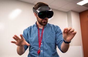
Quest Pro is here and brings with it some welcomed hardware improvements but a dubious value proposition that’s highly dependent on someone else making the right apps.
There’s two ways to look at Quest Pro:
- A better and more expensive Quest 2
- A headset with new features that wants to transform the way you work
The former is pretty straightforward. If you plan on gaming just like you do on Quest 2, Quest Pro is in most ways the superior device. But when you factor in the $1,500 pricetag, there’s just no way the improvements are worth the cost of admission. And that’s fine, Meta really isn’t selling Quest Pro as a Quest 2 upgrade.
Instead the company is marketing some vague value proposition that Quest Pro will ‘transform the way you work’. Officially the company claims that Quest Pro is made for “builders, designers, and inventors. Architects, product designers, prototypers, game developers, engineers, and researchers have historically designed 3D products and experiences on 2D screens. We are giving these builders the ability to visualize their creations in 3D while getting a sense of scale and proportion in context to the environment.”
In theory that makes a lot of sense. In practice, the whole premise is undermined by a host of usability issues and a lack of high quality first-party software that delivers clear value. Meta seems to be banking entirely on someone else building the headset’s core enterprise functionality, at launch making Quest Pro feel like an experiment more than a product.
Finding the Value Proposition
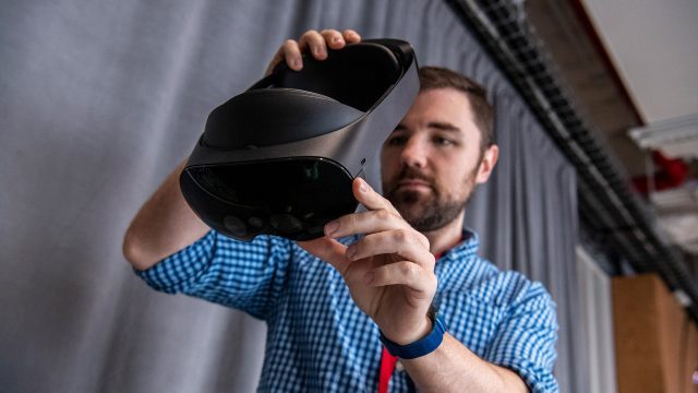
So there seems to be two core ways that Meta expects customers to get value from this $1,500 headset. The first is by using it as a portable workspace, either by tapping into the inbuilt browser or using some sort of virtual desktop software. The second is that maybe you get lucky and somebody builds a third-party ‘killer app’ for your specific workflow.
Curiously, neither of these use-cases really demand the hardware that Quest Pro brings to the table. While some apps are enhanced by what Quest Pro does uniquely (better passthrough and expression tracking), I’ve yet to see an app that really uses them in a way that’s indispensable, making much of the headset feel like new hardware in search of a problem to solve rather than an answer to a critical need.
Usability Debt Rises to the Surface
The thing is, if you look at Quest 2 as a VR game console, it’s a pretty attractive product because it does one thing quite well: play VR games. And when you’re using it to play games, many of the headset’s serious usability issues are masked because generally you’re launching into a single app and then spending almost your entire session inside of it.
Productivity, on the other hand, generally means jumping between lots of different applications and workflows… something that Quest 2 (and, with its identical interface, Quest Pro) is really bad at.
The issues there start at a fundamental level with the Quest interface. Though it began as mere menu, over time Meta has attempted to morph it into a sort of operating system interface. The result? A truly clunky nightmare of usability issues.
And a feeling of productivity isn’t lost just because the system interface is problematic and because jumping between apps is slow, but also because the entire architecture of the platform treats every app as its own siloed experience. So jumping from one app to another to try to get stuff done means dealing with a mess of different interfaces, different avatars, different friends/invite systems, different capabilities etc.
First-party Problems
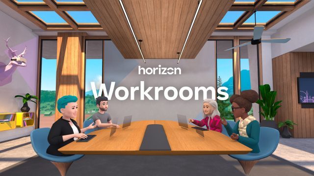
Meta has sorta-kinda attempted to fix this with Horizon Workrooms, a single app that functions as both your personal office (via remote work on your PC or Mac) and a place where you meet immersively with colleagues. In theory that sounds great, but there’s a few key problems.
For one, Workrooms doesn’t even come pre-installed. You could easily end up with a Quest Pro and literally never know that what is ostensibly supposed to be core functionality (remote PC and immersive meetings) is actually hiding in some app you have to find and download from the store.
And what’s more… Workrooms just doesn’t come close to reaching the ease-of-use it needs to make people actually prefer to use it over other options that do not involve being in a headset. Much like the Quest system interface, Workrooms is wildly clunky and really quite unintuitive.
I’ve been professionally working in the VR space for more than a decade now, and while I’m able to figure it out, I can only imagine an employee (with minimal or no VR experience) getting a Quest Pro headset and trying to figure out how to use Workrooms.
I can already hear the poor support person trying to help out on the other end of a call:
Did you click the button on the bottom bar? No the other bottom bar. You have to close the first bottom bar with the right button on your controller. You aren’t using the controllers? Ok pinch your fingers together then move your fingers down over the Oculus logo—I mean Quest logo—while you’re still pinching then let go of your pinch. Did the first bar close? Ok now on the other bar you see in front of you, click the button with the computer icon. You can’t see your pointer? Try moving your hands closer to the little screen there. No not too close, you can’t just tap the button with your finger, you have to pinch to select. Ok now click that computer icon. Do you see anything in the list? No? Ok make sure you launched the remote software on your computer. Yes take off your headset and go to the website and download that and install it. Then put your headset back on and click that computer icon again.
Everything Quest Pro wants to accomplish makes sense, the execution is just seriously lacking for any ‘professional’ who expects to use the device for general productivity work. The intended use cases just aren’t sufficiently supported by high quality first-party apps and capabilities.
Third-party to the Rescue (Hopefully)
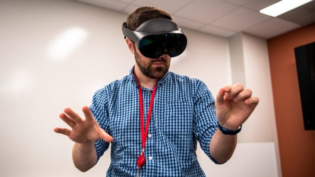
A lack of high-quality first-party productivity features leaves the headset entirely dependent on third parties to pick up the slack… something Meta seems to be seriously praying for.
To that end, the one place that Quest Pro could prove truly useful is if there’s a single third-party app out there that directly benefits your workflow. And maybe there is… maybe you do 3D design and would really benefit from using an app like Gravity Sketch to brainstorm and sketch out models and ideas. Maybe you’re an architect and would really benefit from using an app like Resolve to visualize large 3D models for construction projects.
But this is the kicker… Quest 2 can run those apps effectively just as well as Quest Pro. So what is Quest Pro bringing to the table?
How about the headset’s new capabilities? Better quality passthrough AR and expression tracking are nice to have… but today Meta doesn’t have an out-of-the-box killer app for them, either first or third-party. So why not just get a Quest 2?
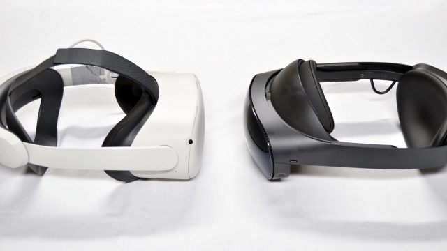 In its present state, using Quest Pro for the things Meta is marketing feels a bit like trying to use your Xbox as a productivity PC. Like… yes, you actually can browse the web on an Xbox, but an Xbox is way better at playing games than browsing the web. And right now Quest Pro is better at playing games than anything else.
Mixed Reality Marketing

Perhaps Quest Pro’s most marketed feature–mixed reality—is still very undercooked. You can manually outline your room to make the headset aware of what’s around you, allowing some apps to interact with those (exclusively rectangular) surfaces that you’ve told it about. But it’s a tedious process which currently provides minimal benefits. And like much else of the system-level Quest functionality, it’s got tons of usability issues; things as obvious as the instruction window blocking your view as you try to draw outlines.
But let’s say you don’t care about the headset being aware of the shape of the room around you. Passthrough still could have another huge benefit which would be allowing you to easily interact with the outside world without taking off your headset. Things like checking your phone or reading from a sheet of paper is the kind of practical usage you’d want for that, but Quest Pro falls short with not enough resolution and still fairly ‘bumpy’ depth estimation for near-field objects.
Even just for wanting a feeling of not being fully immersed by leaving the passthrough background turned on while you work is not quite fully there yet. After using Quest Pro as a browser-based workstation with keyboard and mouse for at least an hour I found I got slightly dizzy and opted to turn off passthrough.
It’s Not All Bad, Just Expensive
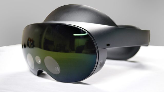 Well there’s a few reasons you might actually want Quest Pro today. The form-factor is a little nicer, though I wouldn’t go as far as calling it obviously more comfortable (unless you’re measuring by the terrible soft strap that comes included with Quest 2 out of the box). The benefit in clarity thanks to the new lenses is definitely a noticeable improvement, but you’re ultimately seeing the same number of pixels… but sharper. The Touch Pro controllers are probably the clearest single win from the headset… but they’re also compatible with Quest 2.
Does any of that justify paying $1,100 more than a Quest 2? Doesn’t look like it to me.
Continue on Page 2: Getting Technical »
from Road to VR https://ift.tt/VnWGLio
via IFTTT
No comments:
Post a Comment