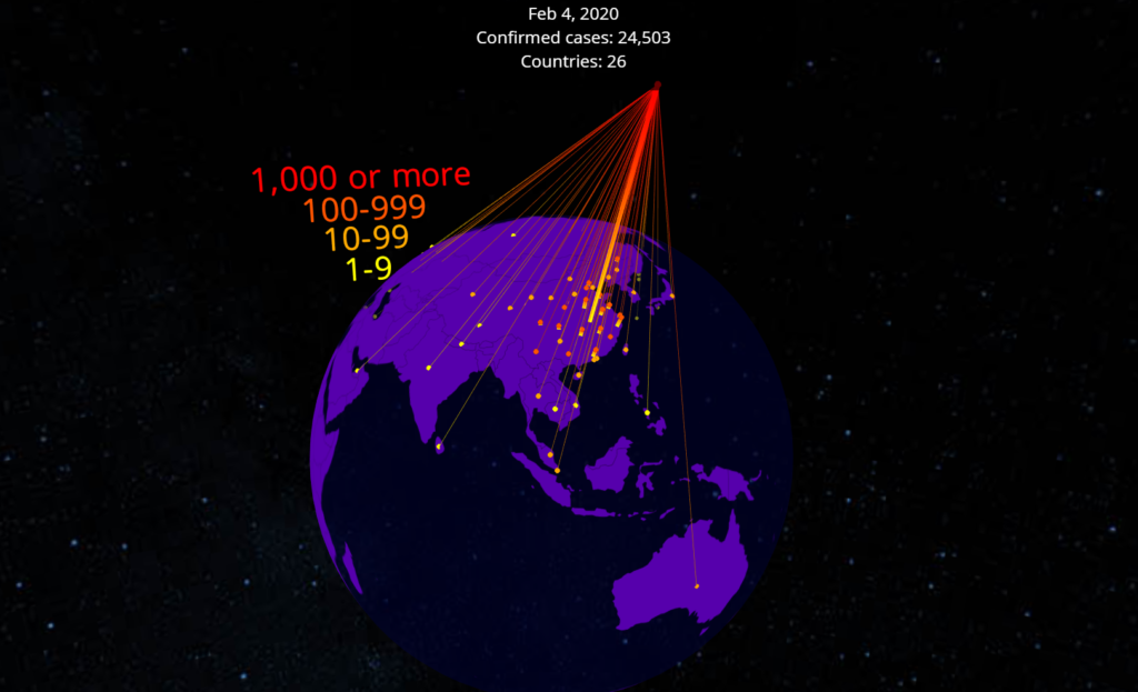
Because statistical data is always more compelling when presented in 3D.
Just one month into the new year and already 2020 is proving to be another turbulent year for the United States as well as the rest of the world. Massive wildfires in Australia, the accidental downing of a Ukrainian passenger jet, the death of Kobe Bryant, the list goes on. As if that we’rent enough, we now find ourselves facing a dangerous outbreak of the fast-spreading respiratory illness referred to as coronavirus.
First identified in the Chinese city of Wuhan towards the tail-end of 2019, Chinese authorities are now reporting thousands of confirmed cases across the massive country. As the epidemic continues to spread, reports are now coming in of cases outside mainland China, including both the United Kingdom as well as the United States. But just how bad are things exactly?

While multiple news sources, including the Wall Street Journal, have been hard at work compiling outbreak data into comprehensive reports, it’s difficult for some to put this complex information into perspective. To assist users in better understanding just how quickly the coronavirus has spread, MIT graduate Michael DiBenigno has developed a WebXR app featuring an interactive 3D model of the Earth that is meant to show how the virus has affected various countries.
Developed using VR/AR data visualization platform Flow Editor, the nCoV-2019 Tracker begins with a global breakdown of all confirmed cases and deaths as a result of the virus — at the time of this writing, 28,353 cases of the coronavirus have been reported along with 565 confirmed deaths. By selecting next, you receive a more detailed analysis of the current situation, including which countries have been affected and to what extent. As you progress deeper into the experience, you gain a better understanding of the exact timeline of events leading up to our current predicament.

It should be noted that, technically, this information is already available through multiple online sources. As reported by RoadtoVR, DiBenigno’s app appears to be using data originally accumulated by The Wall Street Journal. Still, nCoV-2019 Tracker serves as an excellent example of VR’s potential as a data visualization tool.
To check out DiBenigno’s app yourself, visit the project’s official Flow Editor page on desktop or mobile. To experience the magic in VR or AR, visit the same link via a WebVR compatible headset, such as the Oculus Quest, or a dedicated AR headset like the Microsoft HoloLens 2 or Magic Leap One. This may be easier said than done however, as a new statement released by Facebook indicates a delay in Quest production as a result of the coronavirus:
“Oculus Quest has been selling out in some regions due to high demand. That said, like other companies we’re expecting some additional impact to our hardware production due to the Coronavirus. We’re taking precautions to ensure the safety of our employees, manufacturing partners and customers, and are monitoring the situation closely. We are working to restore availability as soon as possible.”
Image Credit: Michael DiBenigno
The post Track The Global Spread Of Coronavirus Using This Terrifying WebXR App appeared first on VRScout.
from VRScout https://ift.tt/2UxB5rq
via IFTTT
No comments:
Post a Comment