From very early on, the SteamVR dashboard had adapted Steam’s ‘Big Picture’ mode which was designed for use on big screen TV’s rather than in VR. As it wasn’t made with VR in mind, much of its functionality is clunky and some of it borderline broken. Now, SteamVR is getting a dashboard overhaul which is ditching Big Picture.
Valve has been making steady improvements to the SteamVR interface over the last year or so. Back in December the company rolled out an overhaul of the platform’s Settings interface, and before that it addressed longstanding audio routing annoyances.
Now the SteamVR dashboard interface itself is getting an overhaul; the first fruits of that work have been released in the SteamVR Beta v1.10.9. If you’d like to preview the update, here’s how:
Opt into SteamVR Beta
- In your Steam games list, right-click on SteamVR > Properties > Select the ‘Betas’ tab
- In the drop down list, select ‘SteamVR Beta Update’
- Allow SteamVR to update
Opt into Steam Beta
- In the main Steam window, click the ‘Steam’ drop-down at the top left > Settings > Select the ‘Account’ tab
- In the ‘Beta participation’ section, click ‘Change’, in the drop-down list select ‘Steam Beta Update’
- Steam may prompt you to restart to install the update
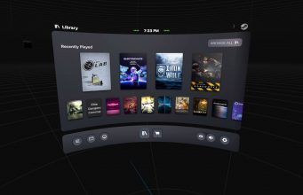
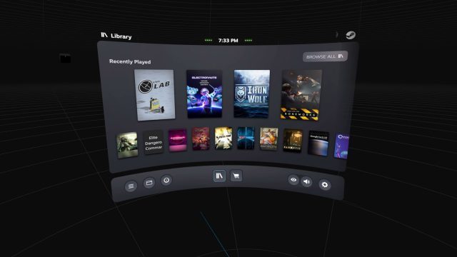
The new SteamVR dashboard is very simple in this beta release, offering a look at your four most recently played titles, as well as a scrollable list of other titles in your Library. 
Photo by Road to VRWhile the dashboard moves away from Big Picture, it hasn’t yet replaced it completely; clicking the ‘Browse All’ button at the top right will drop you back into the familiar Big Picture interface.
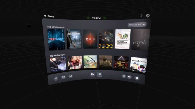
There’s also a Store section in the new dashboard which shows three scrollable sections for now: ‘Top Singleplayer’, Top Multiplayer’, and ‘Top Free’.

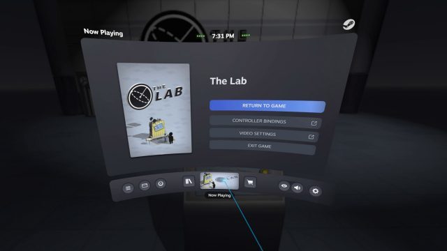
When there’s an active game, the SteamVR dashboard offers up game-specific buttons for controller bindings and video settings which helpfully take you directly to the game-specific settings (rather than making you scroll through a list to find the specific title).

There’s still a lot of missing functionality in the new dashboard (notably any sort of Friends list), and a handful of places where you’ll get dumped back to the Big Picture interface for the time being. However, we expect to see Valve continue to build out the new interface to encompass more and more of the core functionality, and with time we hope to see a more mature interface design that doesn’t rely so much on scrolling.
The post SteamVR Gets a New Dashboard, Finally Ditching Steam Big Picture appeared first on Road to VR.
from Road to VR https://ift.tt/2S41uLK
via IFTTT
No comments:
Post a Comment